Neon Nails and Spa
Neon Nails and Spa
Neon Nails and Spa
Nestled in the heart of central Nanaimo at Rock City Plaza, Neon Nails stands as one of Nanaimo's most enduring salons, boasting a proud legacy of local ownership since 2008. With an unwavering commitment to excellence, the salon prides itself on delivering superior quality services in a warm, inviting, and secure atmosphere, ensuring each client experiences the epitome of professional nail care and relaxation.
Nestled in the heart of central Nanaimo at Rock City Plaza, Neon Nails stands as one of Nanaimo's most enduring salons, boasting a proud legacy of local ownership since 2008. With an unwavering commitment to excellence, the salon prides itself on delivering superior quality services in a warm, inviting, and secure atmosphere, ensuring each client experiences the epitome of professional nail care and relaxation.
Project Year: 2023
Role: Logo Design, Brand Identity, Motion Graphics, Web Design
Status: Complete
Tools used: Adobe After Effects, Adobe Illustrator, Adobe Photoshop, Figma, Wordpress, Elementor
Project Year: 2023
Role: Logo Design, Brand Identity, Motion Graphics, Web Design
Status: Complete
Tools used: Adobe After Effects, Adobe Illustrator, Adobe Photoshop, Figma, Wordpress, Elementor
Project Year: 2023
Role: Logo Design, Brand Identity, Motion Graphics, Web Design
Status: Complete
Tools used: Adobe After Effects, Adobe Illustrator, Adobe Photoshop, Figma, Wordpress, Elementor
Process
Process
Process
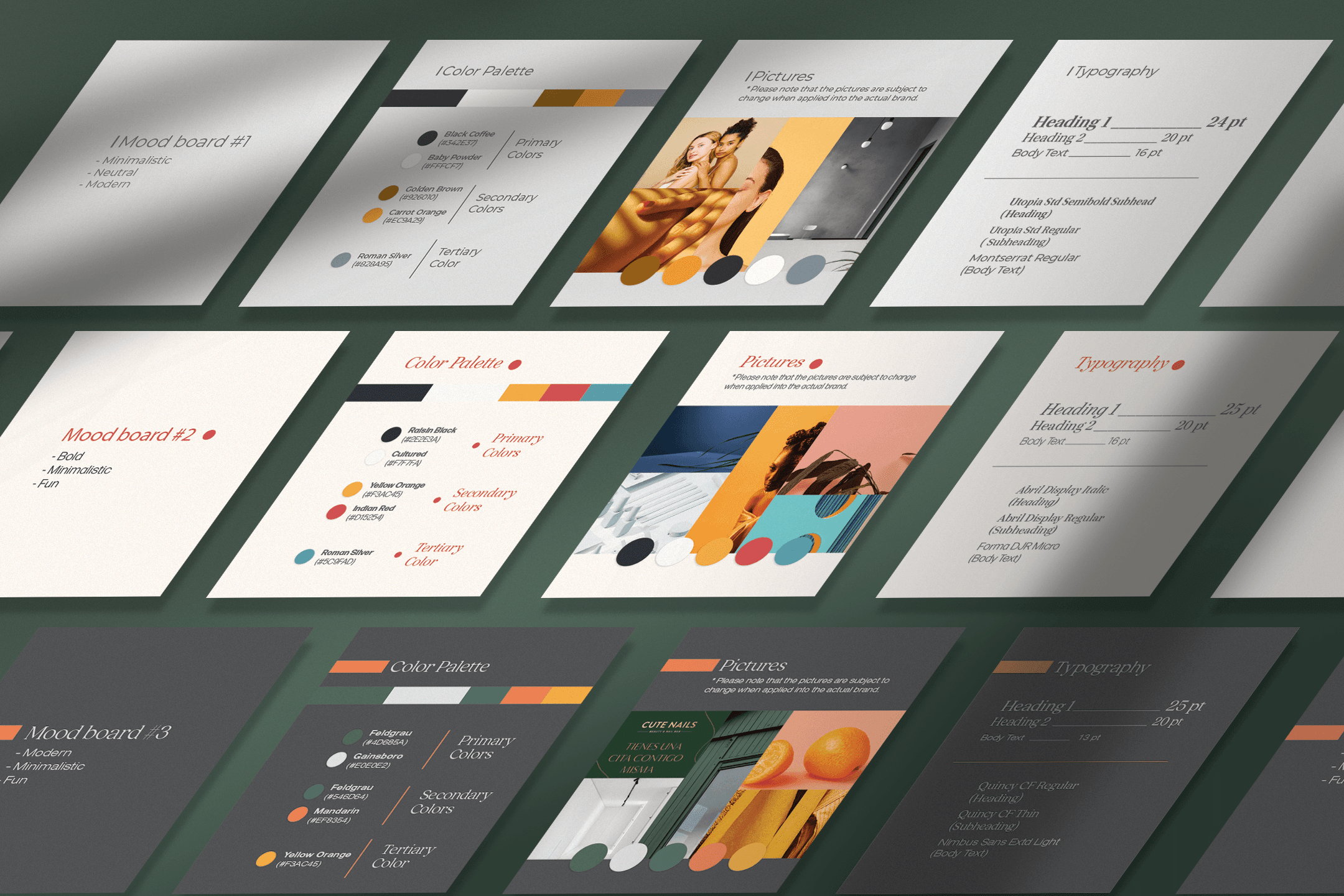
The owner of Neon Nails and Spa had been considering a logo redesign for some time and approached me to help refresh their brand. The original location opened in 2008 on Bowen Road in Nanaimo, and the business has since expanded to a second location at Rock City Plaza. The owner wanted a logo that conveyed beauty, minimalism, and a modern, trendy feel. I created several mood boards to present to her, and she was particularly drawn to the third one, especially the moss green color. From there, I developed two rounds of logo concepts for the client to review and provide feedback on.
The owner of Neon Nails and Spa had been considering a logo redesign for some time and approached me to help refresh their brand. The original location opened in 2008 on Bowen Road in Nanaimo, and the business has since expanded to a second location at Rock City Plaza. The owner wanted a logo that conveyed beauty, minimalism, and a modern, trendy feel. I created several mood boards to present to her, and she was particularly drawn to the third one, especially the moss green color. From there, I developed two rounds of logo concepts for the client to review and provide feedback on.

Final Result
Final Result
Final Result
After several rounds of feedback, we finalized the logo design. The serif font for "Neon" represents elegance and beauty, while the thinner sans-serif font for "Nails and Spa," along with the two subtle lines, creates a minimalist, calming feel that reflects the relaxing experience customers can expect at Neon.
After several rounds of feedback, we finalized the logo design. The serif font for "Neon" represents elegance and beauty, while the thinner sans-serif font for "Nails and Spa," along with the two subtle lines, creates a minimalist, calming feel that reflects the relaxing experience customers can expect at Neon.


Gift Cards
Gift Cards
Gift Cards
To keep up with the growing demand for gift cards during the Christmas season, the owner of the Rock City location wanted to incorporate the new logo and branding into the gift card design. I began by creating a gift card that reflected the brand colors for the Rock City location (green, orange, and white). Later, the owner of the Bowen location requested a similar design for her location, but with a different color scheme—white, black, and red. The final result was two distinct gift card designs, each tailored to the unique branding of their respective locations.
To keep up with the growing demand for gift cards during the Christmas season, the owner of the Rock City location wanted to incorporate the new logo and branding into the gift card design. I began by creating a gift card that reflected the brand colors for the Rock City location (green, orange, and white). Later, the owner of the Bowen location requested a similar design for her location, but with a different color scheme—white, black, and red. The final result was two distinct gift card designs, each tailored to the unique branding of their respective locations.


Brand Identity
Brand Identity
Brand Identity
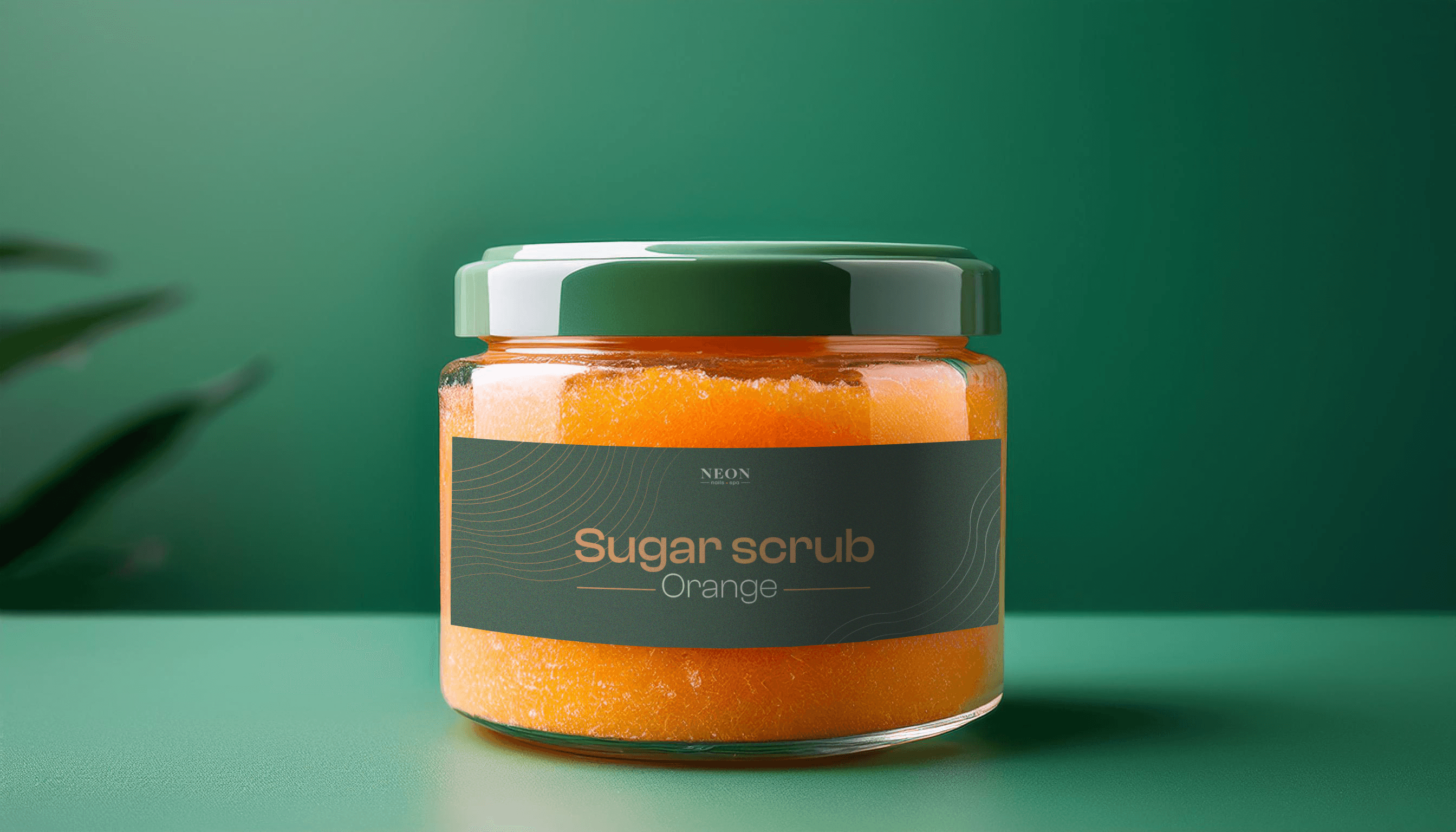
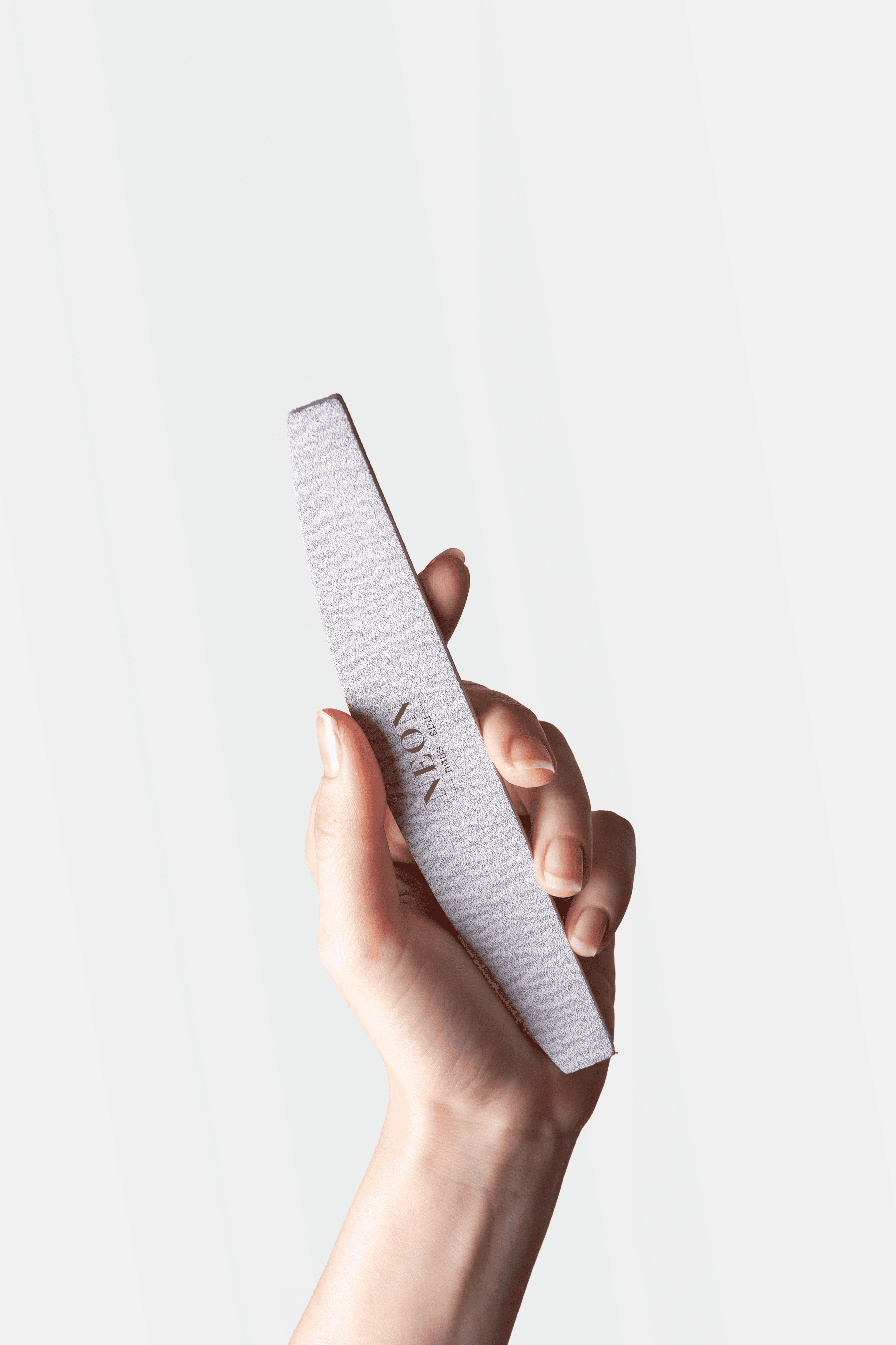
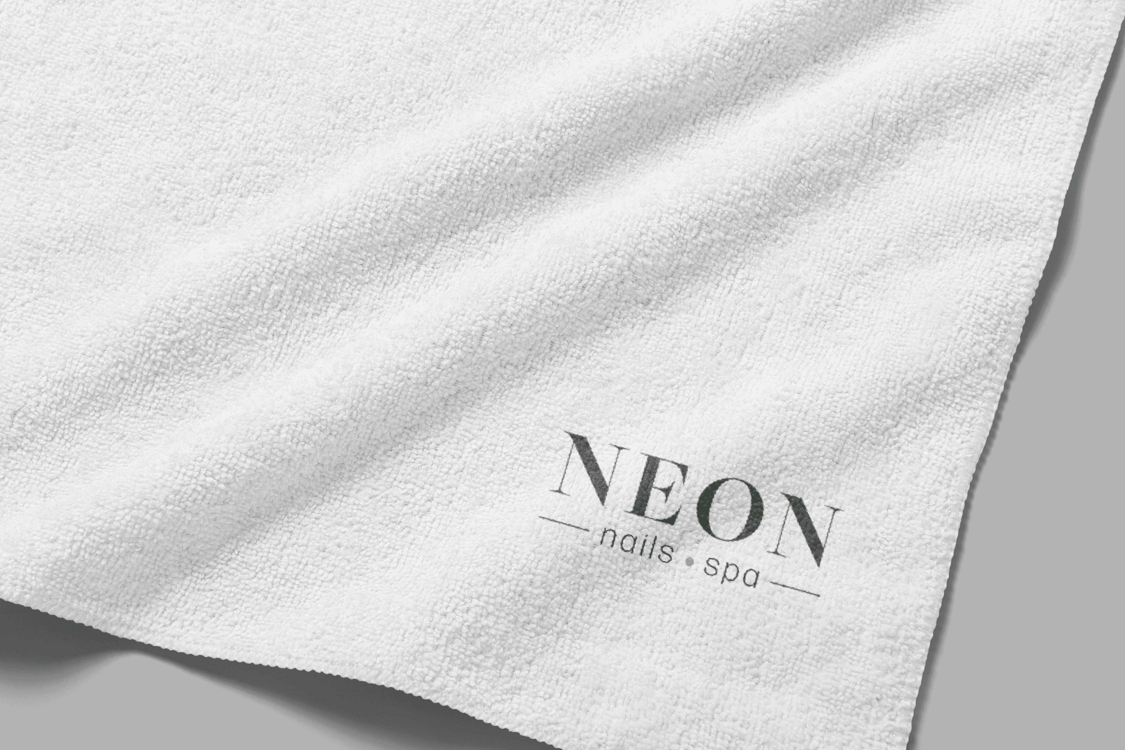
I designed a range of applications featuring the new Neon Nails branding, primarily for in-house products sold at the salon. This included labels for sugar scrub jars, nail files branded with the Neon Nails logo, and other product packaging.
I designed a range of applications featuring the new Neon Nails branding, primarily for in-house products sold at the salon. This included labels for sugar scrub jars, nail files branded with the Neon Nails logo, and other product packaging.


TV Screen Service Menu
TV Screen Service Menu
TV Screen Service Menu
Neon Nails Spa has been using physical copies of its service menu for quite some time. While effective in the past, these printouts often contained lengthy descriptions, which sometimes led to confusion about pricing updates. Customers would occasionally arrive expecting to pay less, only to find that prices had changed. Recognizing this issue, the salon owner sought a more modern, digital solution that would be clearer, more dynamic, and easier to update, all while showcasing the full range of services offered. To address this, I designed a dynamic service menu video for the salon's screens. The video presents the services in an easy-to-follow, slow-moving slide format, organized by sections. This approach ensures that customers can comfortably read through the information without feeling overwhelmed, while engaging graphic elements add visual appeal.
Neon Nails Spa has been using physical copies of its service menu for quite some time. While effective in the past, these printouts often contained lengthy descriptions, which sometimes led to confusion about pricing updates. Customers would occasionally arrive expecting to pay less, only to find that prices had changed. Recognizing this issue, the salon owner sought a more modern, digital solution that would be clearer, more dynamic, and easier to update, all while showcasing the full range of services offered. To address this, I designed a dynamic service menu video for the salon's screens. The video presents the services in an easy-to-follow, slow-moving slide format, organized by sections. This approach ensures that customers can comfortably read through the information without feeling overwhelmed, while engaging graphic elements add visual appeal.
Neon Nails Website
Neon Nails Website
Neon Nails Website
The website was one of the top priorities, following the logo redesign, that the owner wanted to update. After finalizing the new logo, branding, and color scheme, I began working on the website to reflect the fresh look of Neon Nails Rock City. I started by creating wireframes in Figma, which I then reviewed with the owner to ensure the layout and design matched her vision. This also gave her the opportunity to suggest any pages to add or remove. Once the wireframes were approved, I proceeded to build the website using WordPress and the Elementor page builder. The final result is a user-friendly website that allows customers to book appointments, browse services, contact the salon through an inquiry form, and access a helpful FAQ section. You can explore the website at: https://neonnailsnanaimo.com/.
The website was one of the top priorities, following the logo redesign, that the owner wanted to update. After finalizing the new logo, branding, and color scheme, I began working on the website to reflect the fresh look of Neon Nails Rock City. I started by creating wireframes in Figma, which I then reviewed with the owner to ensure the layout and design matched her vision. This also gave her the opportunity to suggest any pages to add or remove. Once the wireframes were approved, I proceeded to build the website using WordPress and the Elementor page builder. The final result is a user-friendly website that allows customers to book appointments, browse services, contact the salon through an inquiry form, and access a helpful FAQ section. You can explore the website at: https://neonnailsnanaimo.com/.